

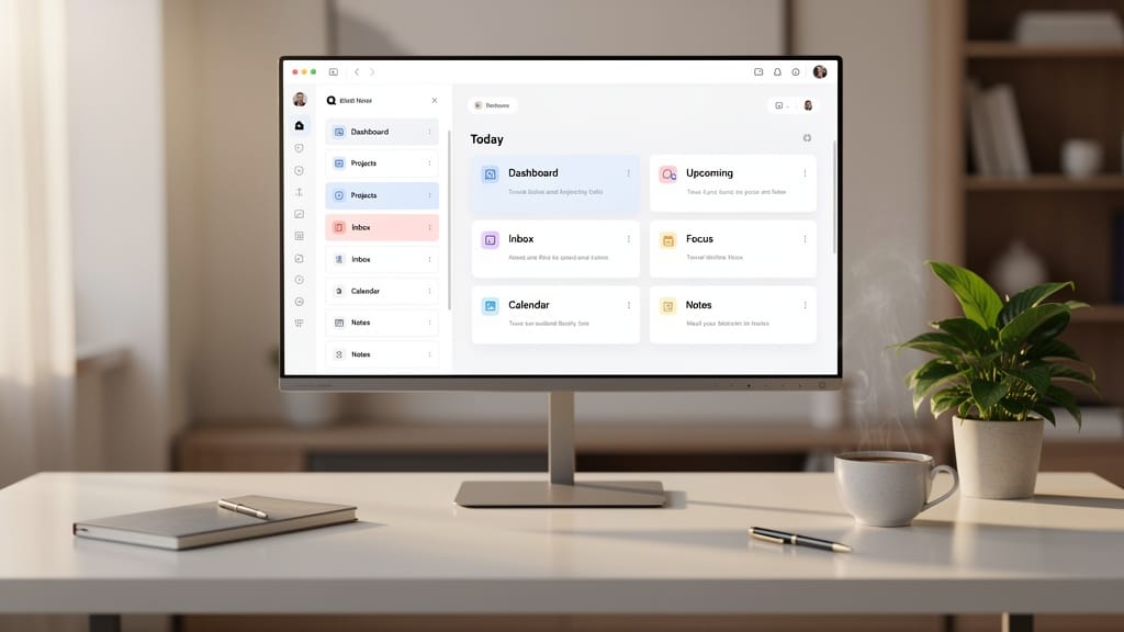
The humble tab bar is having a moment. With Chrome finally embracing the sidebar layout, the browser with vertical tabs is no longer a niche preference for power users, it is becoming the default argument for how the web should work.
Quick Summary
- Chrome is adding vertical tabs, a feature long associated with newer, more design-forward browsers.
- A browser with vertical tabs makes better use of widescreen displays and makes long tab titles easier to read.
- This move narrows one of the clearest gaps between Chrome and rivals like Arc, Brave, and newer experiments such as Dia.
- For everyday users, the change matters most if you juggle dozens of tabs, tab groups, docs, chats, and research pages.
- The bigger story is strategic, not cosmetic, modern browsers are now competing on workflow, not just speed.
- Vertical tabs are not perfect, especially on smaller laptops, but they are quickly becoming a feature people try once and struggle to give up.
What Happened With the Browser With Vertical Tabs Shift
After years of treating the classic horizontal tab strip as good enough, Google is now bringing vertical tabs to Chrome. In plain English, that means tabs can sit in a sidebar instead of crowding the top of the window, where they usually shrink into unreadable slivers once you open too many.
That may sound like a small interface tweak. It is not. A browser with vertical tabs changes the way people scan, organize, and keep track of work across dozens of open pages. It also signals that Chrome is no longer ignoring features that helped smaller rivals feel fresher and smarter.
The timing matters. Browsers such as Arc browser vertical tabs setups and the newer dia browser vertical tabs approach helped turn the sidebar into a symbol of modern browsing. Chrome adopting it is a sign that the mainstream is catching up.
Key Details on Why the Vertical Tabs Browser Trend Matters
Chrome’s implementation appears designed to be optional, not disruptive. Users can enable vertical tabs when they want, and once switched on, that layout remains in place until they change it back. That matters because browser habits are deeply ingrained, and forced redesigns tend to backfire.
Why the browser with vertical tabs keeps winning over heavy users
The core appeal is simple, a browser with vertical tabs lets you read more of each page title. That sounds obvious, but it fixes one of the web’s oldest annoyances. With top tabs, ten open pages may be manageable. With twenty, everything starts looking the same. With forty, the interface turns into visual mush.
Side tabs solve that in a way horizontal tabs never really can. Modern displays are wide. Most websites do not need every pixel of horizontal space. A left sidebar uses room that often goes wasted while giving tabs enough length to remain recognizable.
Chrome is also pairing the change with a refreshed reading mode, which is revealing. This is not just about aesthetics. It is about keeping people inside the browser for more focused work, more reading, and more organization, instead of sending them to specialty apps or rival browsers.
Chrome is borrowing from competitors, and that is the real story
For years, smaller browsers built identities around interface ideas that made traditional browsers feel old. Brave browser vertical tabs gave privacy-minded users a more efficient layout. Helium browser vertical tabs appealed to people who liked cleaner, more deliberate browsing spaces. Arc browser vertical tabs arguably did the most to make the feature feel aspirational rather than nerdy.
Now Chrome is absorbing that pressure. You can see the pattern. Once a competitor feature proves sticky enough, the market leader turns it into a checkbox setting. Good for users, less great for browser startups trying to stand out.
Midway through that shift sits Google Chrome, still the browser most people use by default. When the market leader copies a workflow feature, it usually means that feature has already won.
What This Means for You if You Want a Browser With Vertical Tabs
If you regularly keep five tabs open, this may feel irrelevant. If your browser looks like mission control by noon, it is a much bigger deal.
Better tab scanning, less tab anxiety
A browser with vertical tabs is most useful for people doing research, project management, shopping comparisons, schoolwork, coding, or anything else that involves lots of open pages at once. You spend less time hovering over tiny tabs to figure out what is what. You spend less time reopening pages you forgot were already open. You also make fewer mistakes when jumping between similar documents.
That is the practical win. Not excitement, not novelty, just less friction.
Widescreen laptop users benefit most. On a 13-inch machine, the tradeoff is tighter, because giving up side space can feel expensive. On a 24-inch monitor or an ultrawide display, vertical tabs make immediate sense because the browser likely has room to spare.
Who wins, who loses
Power users win first. Students, journalists, analysts, developers, and anyone living in docs and dashboards will likely adapt fastest. People moving from Brave browser vertical tabs or Arc browser vertical tabs setups may finally get a familiar layout without changing their primary browser.
Browser challengers lose some leverage. Features like sidebar tabs helped smaller players feel distinct. If Chrome closes that gap, rivals need to offer something deeper than a nicer tab strip. That probably means AI workflows, built-in organization, privacy controls, or new forms of search and summarization.
The other losers are bad habits. Vertical tabs make it easier to keep too many pages open without consequences. That sounds good until your browser becomes a storage locker for decisions you never make. Better tab visibility can enable better organization, but it can also enable more clutter.
What Others Missed About the Browser With Vertical Tabs
Most coverage treats this like a simple catch-up feature. It is more than that. The rise of the vertical tabs browser reflects a larger shift in what a browser is supposed to do.
The browser is becoming a workspace, not just a window
Ten years ago, browsers competed on speed benchmarks and standards support. Today, those things still matter, but they are not what users notice most. What people notice is whether a browser helps them manage chaos.
Vertical tabs are part of a new browser philosophy, one shaped by always-open chat apps, project tools, streaming windows, research stacks, and AI assistants. The browser has become the operating system for knowledge work. In that context, layout is not decoration. Layout is productivity.
That is why dia browser vertical tabs and other next-gen browser experiments matter even when they have tiny market share. They test ideas the giants are too conservative to invent first.
Chrome’s move could flatten innovation, or spread it faster
There is a tension here. When Chrome adopts a feature, millions more people get it. That is good. But once Chrome adopts a feature, the original innovators lose one of their best selling points. That can make the browser market less adventurous over time.
Still, the optimistic view is stronger. If mainstream users get comfortable with a browser with vertical tabs, they may become more open to other interface shifts too, pinned workspaces, smarter tab grouping, split views, and AI-driven browsing assistance. The baseline rises. Then the next wave can build on top of it.
Real Examples of Where a Browser With Vertical Tabs Helps
Imagine three everyday scenarios.
First, online shopping. You have 18 tabs open comparing laptops, specs, reviews, return policies, and retailer prices. In a top tab bar, half of them show only a site icon. In a browser with vertical tabs, you can actually read “OLED review,” “return policy,” or “battery test” without guessing.
Second, work. You are switching among Slack, email, a project doc, analytics, two client dashboards, and a calendar. A sidebar makes those destinations easier to identify at a glance. It also pairs nicely with tab groups because the structure becomes visible instead of hidden behind tiny colored dots.
Third, research or school. You may have papers, PDFs, citation tools, videos, and notes open at once. This is where a vertical tabs browser really shines, because the browser stops feeling like a pile of paper and starts feeling like a navigable outline.
Users of Google Chrome are likely to notice this most when moving from a cluttered laptop setup to an external monitor. The extra width turns vertical tabs from a compromise into an obvious improvement.
Pros and Cons of a Browser With Vertical Tabs
Pros
- Better visibility for long page titles
- Easier management of large numbers of tabs
- More natural fit for widescreen monitors
- Stronger support for tab groups and work-style browsing
- Lower friction for multitasking
Cons
- Takes away horizontal room from webpages on smaller screens
- Can feel unfamiliar at first
- May encourage tab hoarding instead of cleanup
- Not every website layout plays nicely with reduced width
- Casual users may never need it
Conclusion on the Browser With Vertical Tabs Era
The arrival of vertical tabs in Chrome confirms something smaller browser makers figured out years ago, the browser interface still matters, and small layout choices can have outsized effects on how people work. A browser with vertical tabs is not a gimmick anymore. It is fast becoming the smarter default for anyone who lives online.
My guess is simple. Within a year, vertical tabs will stop feeling like an alternative view and start feeling like one of the clearest signs of a modern browser.
Sources
About the Author